Tuesday, December 31, 2013

2013 Design Trends

December has positively flown by and it's hard to believe that we'll be ringing in the New Year in a matter of hours.  For my last post of 2013, I thought I'd do a quick review of some of my favorite design trends of the year.  This list is by no means exhaustive, (there are too many to note) but I I tried to pick a handful that interest me and I think we will see carrying through into 2014.

1) Oversize Cone Pendants
I see these used in pairs over islands in kitchens, or singly over tables in dining areas.  I love the simple yet bold shape, the large scale, and the reflective paper on the inside.
love the brass interior of the Pendant lights and the trim on the hood.  Look at that wall siding

2) The 70's Make a Comeback
We thought we'd never see it, but here it is, a glamorous take on the 70's: shag carpeting, low-slung seating, wall paneling, bohemian floor pillows and poufs, and funky, ethnic-inspired side tables and accent pieces.  Who knew the 70's could be so chic?
brass-interior

3) Brass Fixtures and Accents
While we've all been busy replacing old, out-dated fixtures, brass has quietly been making a comeback. Used in small doses and in the form of high-quality pieces (no $25 ceiling fixtures please), brass can be very elegant in the home.  
brass-interior-design

4) Honeycomb Light Fixtures
I love unique lighting, and this style in particular makes my heart skip a beat.  The geometric shape and pattern excite my eye and make this fixture a standout in any room, be it classic or contemporary.
Cameo Homes: Blue gray walls paint color, Suzanne Kasler Large Morris Pendant in Clear Glass, creamy ...
Honeycomb Glass Pendant Shade

5) Jewel Tones 
Emerald Green has been officially declared the "It" color for 2013.  I would go a bit farther to say that jewel tones in general are popping up everywhere.  Whenever I go to the design center to browse for fabrics, the tones I see over and over are Emerald Green, Peacock (or Teal) Blue, Raspberry, and Deep Indigo.
emerald, emerald decor, emerald interior, emerald homewares

6) Campaign Chests
These versatile pieces are popping up everywhere and it's easy to see why!  Designers and savvy homeowners are buying them in vintage form, painting or lacquering in bold colors, and using wherever storage is needed--a buffet in the dining room, nightstands in the bedroom, filing in the office, or a media console in the family room.  They are particularly great when pushed together as a pair, as seen here.

campaign chests (Lonny)

Judith Balis Interiors: Gold and white, Petal Pusher wallpaper, Oh Joy Studio, purple, teenage girls room, glamorous, lucite lamp, fur, upholstered headboard, campaign chest

black and white #campaign chest #blackandwhite

7) Wallpaper
Wallpaper has been so overused in the past, and in sickeningly-sweet floral patterns and colors, that clients often cringe at the mere mention of it.  However, wallpaper is back and has been for some time.  While grasscloth is always an understated designer favorite, I also like bold patterns in simple, neutral tones, as seen below.  I recommend using it in small spaces where you can get big impact without having to over-commit.  Maybe inside a pantry, a powder room, a master bedroom closet, or the back wall of a china hutch.   I also think it looks best when there is a lot of white to break it up (cabinetry, wainscotting, etc) and keep it from overwhelming the room.
Feature walls are back in!

8) Reclaimed Wood
If you haven't noticed this trend, you might be living under a rock.  Reclaimed wood is everywhere.  Again, I like it in smaller doses and against lots of white, whether that be in the form of cabinetry, painted walls, or crisply tailored furnishings.
reclaimed wood wall | Reclaimed Wood Wall | Decor

9) Live-Edge Wood Pieces
Design trend number nine piggy-backs on trend number eight.  Live-edge wood pieces are very popular right now in the form of tables, fireplace mantels, display ledges and benches.  Use one as an accent piece, especially in contemporary settings, but don't overdo it.  If you use it everywhere, your room starts to look like Uncle Wally's creepy cabin.
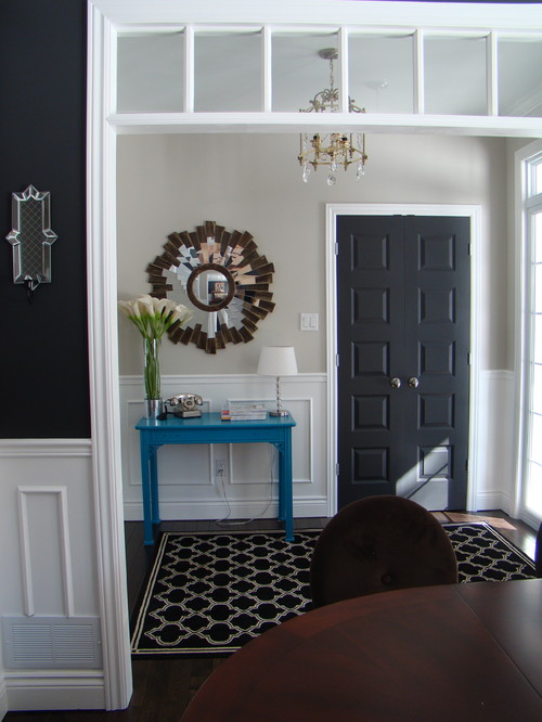
reclaimed wood table

10) Neutrals!
White walls and soft neutrals are the new design standard.  Gone are the days of dark interiors, accent walls galore, and heavy palettes.  Today, everyone wants to freshen up and get a clean, carefree look.  Neutrals can go a long way when paired with interesting shapes, textures and eclectic pieces from a variety of style periods.  I'd love to dissect this room and point out all the interesting things going on here, but I think I'll save that for another blog post.
Whites, Neutrals, tape detail on ottoman

What other trends have you noticed?  Are they favorites or ones that you'd rather see disappear along with 2013?  Let's keep the conversation going.  It would be fun to discuss ideas and expound more on some of these (and other trends) in the coming months.

For now, Happy New Year!  I hope you feel inspired, blessed, and ready to tackle another year.

--Sheila


Saturday, November 23, 2013

Fit for a Princess

My weeks have been busy lately, juggling kids, clients, meetings, art lessons at my son's school and the endless list of household chores.  When things get too busy, it's easy to lose focus on what makes my career so fun--creating beautiful spaces and seeing my clients' happy smiles. I had one of those moments recently and it truly made it all the stress and busyness seem worthwhile.

This week I got to do an installation in a little girl's bedroom.  Let me begin by saying that this little 10 year-old is an absolute doll.  I have boys, but if I had girls, I'd want them to be just like her.  She's sweet, smart, funny, polite and just generally great to be around.  She likes decorating, art, and little crafty projects.  She even hand-makes her own thank-you notes.  How charming is that?!

Almost one year ago, this young lady lady moved with her family into a new house. (One of my many custom-home projects.  Go to www.sheilamaydeninteriors.com , click on "Portfolio", then "Le Magnifique" to see the rest of the house.)  When she moved in, she was promised a pretty bedroom with lots of nice, girly touches.  She has been patiently waiting all this time for her mom and me to get things just right.  Needless to say, after waiting almost a whole year, she was getting pretty anxious to see this all come together.

Wednesday was the big day, or "Canopy Day" as she was excitedly calling it.  You see, she was getting her first bed canopy and she was ecstatic.  I was excited too.  I don't do a lot of children's rooms and a custom bed canopy was actually a first for me.  I agonized over the details for a long time--trying to decide how big it was going to be, how it was going to hang (there was a heat vent in the ceiling directly over her bed that couldn't be blocked), what sort of fabric to use, should it have fringe or ruffles, etc, etc.  The moment of truth was finally here.

The big install (not really that big) included the custom wall-mounted bed canopy, some new coordinating bedding with matching accent pillow, a new seat cushion and pillows for her window seat, and some pretty, ruffled, cafe curtains to hang in the window. This all came together while previously-mentioned young lady was away in school.  Her mom and I were giddy with delight when we saw the finished product.  It's hard to say who's going to like this room more--the mother or the little girl!

Here's a sneak peak of how it all came together.  Please note that these photos were taken with my rather gimpy pocket camera (very old and with a broken flash) and I have yet to do the formal photos.  These pictures don't do the room justice, but hopefully you get the sense of how fun this little project was.  :-)

(The room during construction.)
  The bench seat and flanking bookcases were my custom design.

(Post move-in, as decorated by the young lady, pre-Sheila Mayden Interiors.) 

(The bed canopy on the day of the install.)
  Many thanks to my great installer, Frank Larson!  You are a miracle worker!
And another charming side note: the ceiling fixture was brought from her bedroom in her old house, for sentimental reasons.  I love that!

(View of the whole room.)
  My only disappointment here is that my camera didn't render the colors very accurately.  The room looks warm and sunny in person.

(Close up detail of the bed.)
  I found the mirror (over the bed) after we had selected our fabrics and was so excited because the color was a perfect match.  That's serendipity at it's finest!

(Close up detail of the window seat and cafe curtains.)
I love how this all came together, right down to the little crystal knobs on the bench.  So pretty, feminine and fitting for a little lady.
I hope you enjoyed this little glimpse into one of the joys of my job.  It was such a fun day and even my husband noted that I was still beaming at the dinner table that night.

Thursday, November 7, 2013

Painted Doors - Anything But White

When my husband and I went to Germany on our honeymoon nine years ago, we fell in love with the little medieval town of Rothenburg.  Part of Rothenburg's charm was that all the homes had beautiful old doors, with exquisite carved details, and they were painted in a rainbow of colors.  We spent the better part of the day wandering up and down cobbled streets taking photos of our favorite doors.  At some point it became a contest to see who could find the coolest door and take the most artistic photo.  It's one of my favorite memories from our honeymoon.

A colorful exterior in Rothenburg, Germany
Here in the states, people have pretty much accepted the notion of a bold, painted front door, but that is where most of us stop.  We think nothing of having a red front door, but when it comes to the doors on the interior of our home, we gravitate to our safety zone of white, off-white and cream.  I wonder why that is?  Even the American colonists painted the walls, trim, and doors inside their houses with bolder colors than we do.  Most of us think that classic American architecture means white trim on white walls.  The truly historic colors might blow your mind.  Those colonists make us look like color wimps.


historical paint colors
Govenor's Palace, Colonial Williamsburg, VA
Lilac and Red in a Historic Home

George Washington's Mount Vernon Estate


So maybe we're not going to rush out there and paint our walls a vibrant shade of lilac, or over-the-top emerald green, but maybe it's time to rethink the rules a bit.  Who's to say we can't paint our doors and trim a color? Anything but white!

I snooped around on Pinterest today and found some fun examples.  Let's start with something fairly basic: Black.  We've long admired the stateliness of a black front door on the outside of a home, but what happens when you bring that same notion inside?  For starters, you could paint BOTH the interior AND the exterior of your front door black.  Bring some of that drama into the foyer.  Even when the rest of the trim is left white in this historic home, the black door pops and makes me say, "Wow!"  I love how they've then repeated smaller doses of the black on the stair newel and handrail and in the wall art.  The bright gold-toned wallpaper and the crisp white trim keep this foyer from being anything but dark and grumpy.  

My mother always tells me I wear too much black. I'm thinking I need a glossy black door inside the house too...   http://atlanta.styleblueprint.com/home-and-garden/inspiration-black-walls/
Stately and Beautiful
To take it one step further, you could paint a coat closet door black, as seen here.  This home also has traditional bones and most of the trim has been left white.  The black closet door adds graphic punch and elegantly repeats the inky hue on the dining room walls in the foreground.  They've used black to make a traditional home look more trendy and graphic.  I think it's a nice balance of old and new.  
Montreal Entry Design by Tamara Anka


Or if black seems too ominous or dramatic for you, how about an earthier neutral?  Maybe a brown or a gray?  Here the doors to this bathroom have been painted a deep chocolate brown, accentuating the richness of the door hardware and contrasting against the crisp white of the classic subway tile.  Suddenly I'm intrigued by the room and want to take a second look.
Brown painted interior doors Benjamin Moore: Night Horizon Satin Finish enamel
Rich Brown Adds Interest
Then for the playful but color-phobic, there is the option of adding chalkboard paint to one of the recessed panels of your doors.  The looks says, "we're not too serious around here," but at the same time there is a practical element to the idea and the color combination is classic.  Seems perfect for a kitchen in a busy home, as seen here.  
The Lovely Cupboard: DIY: Chalk Paint Door
Pretty and Practical

Ahhh, gray.  I love it.  So restful and easy on the eyes.  Here all the rest of the trim is white, but they've painted the living-room side of these barn doors in a soft gray to match the kitchen cabinets.  I like how it ties the two spaces together without being overly dominant.  I could be right at home in this space.  There's not a lot of color, but there are interesting shapes, patterns and textures that keep your eye moving about the room.
barn doors-love the color
Easy Elegance

So now for some bold color.  As I mentioned earlier, the easiest way to try this out is to paint both sides of your front door the same accent color.  Here they've brought a cheerful yellow into their all-white, cottagey foyer.  I love this look.  It seems very fitting with the decor: happy, homey, and with just the right balance of neutral and zip.
nice entryway, yellow door
Pure Charm

Taking it one step further is this BRIGHT yellow door inside an eclectic home.  The bones of the space seem pretty traditional (notice the door casing, the extra high base molding and the four panel door) but the decor is witty, youthful and very mod. Something tells me this person likes to live in the moment and have fun.

painting door edges. need to do this in den
Bold and Playful

And talk about color!  This is the extreme.  Shocking orange says, "wake up and pay attention!" Too bold for some, but I think it works here because everything else about this interior is crisp, clean, simple, and mostly white.  It's also very contemporary, which lends itself well to a few bold pops of color.
painted doors
Not for the Faint of Heart

Still not convinced to paint out your white doors, but want to try something new?  How about adding some pattern to your white doors?  Let the doors be the canvas for your creative expression.  I love how this person has used brass upholstery tacks to mimic the abstract geometric pattern found on the walls.


door treatment
Artistic Expression

And lastly, painted doors can be a great alternative for kid's spaces.  It's a kid's room for goodness sake, add some color!  Here the walls are already painted a pretty shade of girly-pink, but the homeowner has toned down the sweetness and given it a bit of contemporary edge by painting a door the same shade of mossy green as found of the window shade piping.  I think it's a great touch and very current.
painted door
Pretty Nursery

So get out there, buy some paint and experiment.  It's cheap, easy, and can be easily be fixed if you aren't happy with the results.  Remember, there's no rule that says all doors have to be white.
Honey We're Home: Black/Gray Painted Interior Doors
BEFORE and AFTER,
From the Honey We're Home blog


Thursday, October 31, 2013

Lighting Quest

I've been working with a client for a couple weeks now, trying to nail down all the lighting selections for a large home reno/addition project.  We have the bulk of the fixtures picked out, but there are still a few gaps left to fill.  As a result, I have lighting on the brain.  I really enjoy selecting fixtures, but have to confess, on a whole-house project like this, it's ALWAYS a challenge.  I'm not one to just pick a collection and stick to it (too easy!), but instead like to hunt and peck for hours on end until I find just the right ensemble of perfectly matched and mismatched pieces.  There has to be a balance between variety and harmony in the whole lighting scheme.  If you don't believe me, look at the lighting package the next time you see a really chic home in a magazine.  The fixtures never match.  Instead they are a very unique collection of pieces that seem to have been collected over time.  Think of lighting like you would jewelry--you select different pieces for different outfits.  They're all unique, but they all appeal to your personal sense of style.  When I try to communicate this to clients at the start of a project, I think they freak out a little. At first the task seems daunting and they lack confidence to mix and match styles and finishes, but by the end of the project, they LOVE the lighting and feel proud of how it reflects their own personality and definition of home.

This week's task is to find pendant lights appropriate for bedrooms that will work with very high, vaulted ceilings.  They have to be somewhat whimsical (funky is good) but also work with a 40's vintage house.  So far, on the main floor, we have a great mix of industrial-meets-classic/vintage-meets-glam, that shows off the bones of the house while highlighting the fun and warm personalities of the folks who live there.  Here's a peak at some of the main floor selections:

Capiz Flushmount
Foyer: Pottery Barn Capiz Shell Flushmount   (Petite, pretty and welcoming)

 Sparkling Light Show Flush Mount Light
Living Room: Shades of Light Crystal Flushmount  (Adult space can use a little bling, but here the oil rubbed bronze finish keeps it from looking too frilly or precious)
Paxton Glass 8-Light Pendant
Dining Room: Pottery Barn Paxton 8-light Pendant  (Looks great with the adjoining, farmhouse-like kitchen!)


World Imports 7821 Luray Wall Sconce
Dining Room and Living Room Wall Sconces: World Imports Luray Wall Sconce (Simple and understated with a contemporary edge.)

Kitchen Island Pendants: Savoy House Schoolhouse Design Mini Pendant (Classic--again, supports a beautiful, farmhouse-like kitchen.)
George Kovacs P5044 Tube LED Wall Sconce
Bath Vanity: George Kovacs Tube Bath Sconce  (A little more contemporary, but suits our other bath fittings to a T.)

The main floor has standard 8'high ceilings, so our fixture selections for those areas have been fairly modest in size.  However, the ceilings on the second floor are really high and allow us to play with scale and design a bit more.  The client really loves Monrovian star pendant fixtures and I agree that we have to put one somewhere in the house.  The question is where.  I think we've finally settled on the Master Bedroom as the right place for this fixture.  We'll put two of them up near the ridgeline, spaced in such a way that they divide the room into thirds.  I'd love it if we could do something more to dress up the vaulted ceiling, like adding wide plank tongue and groove boards, painted white, to give it that classic, cottage-loft feel.  Even if that doesn't happen, I think that two of these star pendants are going to add a really beautiful feel to the room--sort of ethereal and magical, like being in an outdoor gazebo on a summer's night.  Just the right amount of playfulness and romance.

Oversized Morovian Star Pendant
Master Bedroom: Pottery Barn Oversized Monrovian Star Pendant

Across the hall we also have a large, lofty Family Room/Kid's play area.  We wanted something fun and playful there, yet mature enough to suit adults who might be lounging and watching a movie.  These capiz pendants from West Elm seem to have just the right feel.  We'll use the largest of the three and hang it in the center of the room.  Besides just being a really cool fixture, it helps to tie in the foyer below, which also sports a capiz shade.  

Capiz Orb Pendants
Upstairs Family Room/Play Room: West Elm Capiz Orb in large size

The are still a few more gaps to fill, so I'm hunting and pecking for those last few pieces.  I can't wait to see how it all comes together.  I love that these clients want a house that is fun, interesting and truly a reflection of their personalities, not just cookie-cutter and nice-but-safe.  Should be great when it's all done!


Thursday, October 17, 2013

A Book-Lover's Paradise

There's something about old houses....the lovely creak of hardwood floors, imperfect plaster walls, beautiful moldings, solid-wood doors, cast iron tubs, interesting little built-in features and charming antique fixtures. To me they all say "home" in a way that new houses can't.  They have history, that have character, and above all, they have quirks.  I adore quirky houses!

My house has none of that.  Okay, so maybe it has quirks, but not the charming kind.  I saw this photo on Pinterest tonight and instantly fell in love.  This is definitely NOT a new house.

Reece Witherspoon’s Ojai, California home in Elle Décor
(Reece Witherspoon’s Ojai, California home in Elle Décor)

There are so many things to love here:  the little arched closet doors, the mismatched but very interesting light fixtures, the casual mix of pattern and color, the soft plaster walls, the arched doorways, the ceiling detail and the wide-plank hardwood floors.  What I love most though is the built-in reading nook.  Oh heaven!  I just want to dive in and curl up with a good book.  It looks so peaceful and inviting, not to mention decidedly feminine.  (My house is pretty much all "boy" at the moment.)  I think I may need a little reading nook like this.  And a little pink to top it off wouldn't hurt either.  

Thursday, October 10, 2013

Jazz Up That White Kitchen

It's no big secret that I LOVE all-white kitchens.  There's something very timeless about white Shaker cabinets, paired with white marble (or quartzstone) counter tops, and a white, subway tile backsplash.  As much as I like to experiment with new colors, products and finishes, the white kitchen is a look that I always come back to. Depending on how you dress it, it can be very sleek and modern, or it can be folksy and quaint.  Either way, the look is classic and never goes out of style.

The question is, how does one do an all-white kitchen and not look boring?  How can you make sure your personality and unique sense of style show through, and how do you tie it in with the rest of your home?  Consider this simple trick:  The runner.  A runner rug strategically placed in front of the sink or the cooktop will add instant pattern, color, and texture, while allowing you to make a personal style statement.  An added bonus will be the comfort it provides underfoot.  That little bit of extra cushion will help save your back when you labor over that next five-course meal. Ha! ;)  And don't worry about those occasional spills.  Just keep a little spot cleaner on hand (I like Spot Off by D. A. Burns) and you'll be good to go!

A quick look at some fun examples and you'll see just how versatile this little trick can be.  (All images from Pinterest.)  From very traditional (even antique!) to modern and edgy, the choices are endless.  1 rug = instant personality!

Cantley & Company - exterior wall vent for hood, would put pineapple on hood, subway tile up, white cabinets, nice runner
Lovely old-world feel.  The colors and pattern in the rug make the room cozy and inviting.

white, open shelving in the kitchen
Fresh, modern, and youthful.

makes me want to paint my kitchen cabinets white again and I super love the natural rug/runner.
Simple, cottage-y and a bit rustic.  The perfect beach house look.

Investigating refrigerator placement. Mainly just to piss Charles off.
Elegant without being stuffy.  Why not bring that heirloom-quality rug into the kitchen?

Small Open Kitchen | House & Home..  maybe a runner or rug to break up all the wood tones
Modern and chic-- Love how they mixed two different styles/patterns, one on either side of the island.

white kitchen with tribal accents
Can't find one, long rug in the right size?  Try two...one if front of sink and one in front of stove.

Cute cottage, like the ceiling
Bright color and playful pattern make this room feel fun and friendly.

Country Kitchen
Interesting mix of old and new.  Stylish, effortless and very French.
Feeling inspired?  I hope so.  Even if you don't have an all-white kitchen, try a new rug and see what it does for the room.  It's an easy style trick and one that can easily be changed when you get tired of it.  Above all, play and experiment.  Bring a few home and see what looks the best.  (And don't forget a non-slip rug pad.) You might be pleasantly surprised with the results.