Tuesday, September 6, 2016

The Must-Have Breakfast Nook

I think every designer has a few signature pieces or ideas, that he or she likes to incorporate into every project.  One of mine has to be built-in banquettes and casual, comfortable breakfast nooks.  When I begin the planning phase of a new kitchen remodel, I am always looking for ways to incorporate a built-in window seat to anchor the back side of a breakfast table.  The custom built-ins provide character and charm, while the bench seat allows drop-in guests to squeeze in--family-style! For extra seating, I add comfy chairs that invite one to stay and relax, rather hard wood that ones that scream dine and dash.  Aesthetically, I seek out warmth, texture and beautiful finishes, yet my practical side demands forgiving fabrics, so that meals with kids can be relaxing and worry-free.  The challenge is to incorporate all of these ideas into one cohesive space, that eventually becomes one of the most-loved and most-used areas of the home.
 
Here is one little dining nook, that I designed quite a while ago, but still love for all the reasons listed above.

This was a kitchen reno project that included the addition of a new bay window at one end of the room.  As is the case with many Tudor-style homes, this kitchen was tiny and narrow, so there wasn't the space for a free-standing island with bar seating.  The little window bump out gave us the room for a sweet little seating nook instead.  It's the first thing you see when you enter the kitchen (just off the foyer, so very visible!) and it gave us a pretty focal point.  The bench seats have hinged tops and storage inside, to make up for lack of space elsewhere.  Another favorite bit for me was the wrap-around stone countertop, that flowed from the breakfront cabinets on either side of the nook, around and into the window ledge, nicely capping off our custom upholstery.  Everything has a nice, clean, fitted feel--important when space is at a premium!
 
Here is another, more recent project.  This nook is very different in feeling (more airy and open), yet still very compact.  I love all the soft, soothing fabrics, the simple drum-shade pendant, and custom valance that coordinates with the pillow fabrics.  Perhaps the best feature though is the corner window, which offers views of the garden while one is sipping coffee or enjoying a sandwich.  Who wouldn't want to linger here?


This last example from my portfolio archives is a simple, under-the window bench, with built-in china cabinets on either side. 


This window was existing when we started the kitchen remodel, and we decided to just work with the size rather than change it.  There wasn't enough room for a proper backrest, so we made-do with an abundance of comfy pillows.  One neat feature is the proximity of the coffee/tea counter, which is just off to the right and visible in the second photo.  Though simple in design, I think it all came together nicely.  In fact, this image is my most-pinned on Houzz.com!  As of today, it's up over 7,000 pins, so something about this little spot must resonate with homeowners.  So much so, that one of the Houzz.com contributing editors wrote about it in an article.  Too bad it was in Italian!
http://www.houzz.com/ideabooks/60063317/list/16-angoli-colazione-che-vi-faranno-diventare-mattinieri Actually, I shouldn't say that...the ironic thing was that the homeowner IS Italian and she was able to get someone to translate it for me. My image is the last one in the article, and it closes by saying "For the most lazy...Like a family room: a warm and inviting breakfast nook is the place to grant oneself a last moment of relaxation before going out.  The key ingredients:  Wood, warm color, and indirect light."  I couldn't have said it better myself!

Sunday, May 22, 2016

The Make-Me-Beautiful Kitchen Project

 
These days I am working on yet another white kitchen project.  What can I say?  I love a classic, all-white kitchen!  This one is particularly fun because the room is bright and airy, with huge windows and water views, and high ceilings that make you feel like you are floating.  Not only is this project great in terms of the design possibilities, but the client is an absolute sweetheart, making the whole process a real treat--from developing the new space plan, to selecting the custom cabinetry, and shopping for finishes and fixtures.  Designing a custom kitchen can be challenging, but sometimes the work feels more like play when you are inspired by the details and you enjoy the company of the people around you.  Such is the case on this one!

For this post, I thought it would be fun to share a sneak peak into our progress, so that you can see where we started and where we hope to land when the project is done.  To begin, my client came across an image of a  kitchen that she absolutely loved on HomeBunch.com.  This kitchen has served as inspiration for a lot of our design decisions.  Here is that kitchen:

white kitchen, dark floors: 


We both like the white, raised-panel cabinetry, the dark hardwood floors, the farmhouse style sink, and the elegant niche created around the range, with above-counter spice storage pull-outs and the full panel wrap on the upper hood.

And here is what my client's kitchen looked like, pre-construction:


Our "Before" shot, looking through the kitchen to the family room beyond.
 
Looking the other way, towards the water and the formal dining room.  You can't see the breakfast nook here, but it is off to the right.  The breakfast nook has wrap-around and (nearly) floor-to-ceiling windows so that you can enjoy the views.  Stunning!
 

 As you can see the house has an early 90's feel to it and the kitchen is practically begging, "Make me beautiful!"  With it's Maple, slab-front cabinetry, this room is trying to be contemporary, but at this point just feels dated and uninspiring.  The room has two open pass-through windows which I'm not crazy about design-wise.  While they do contribute to increased "openness", they feel rather cheap and stripped down.   And there is so much empty wall space between the tops of the cabinets and the ceilings.  What a waste!  We intend to fill this space will full-height uppers and a rich, built-up crown molding.  The pass-through window opening that you see in the second photo will disappear, as the doorway into the dining room is being significantly widened and properly trimmed out with a wide, handsome casement.  If there is one thing this house lacks, it's properly-scaled molding.  Lucky for us, it's going to be added back into the equation!

Once I had developed a proper kitchen layout--one where our new sink and range are deliberately situated to take advantage of the gorgeous water views, as well as provide visual contact with the adjoining family room and formal dining room--the next step was to select cabinetry and finishes.  We went with a raised-panel door style, similar to the initial concept photo, with glass-door uppers on two walls.  The range, which will sit where the old refrigerator was in the "Before" shot, will have a paneled surround, much like the one in our concept photo.  Here is an early sketch I did of our own design:


I am hoping it will look and feel similar to this when we are done, but with the addition of a little more built-in storage:
 
Cabinetry, range nook, marble:
Another great kitchen found on Pinterest


To pair with the white kitchen cabinets, the client has been going back and forth between Calacatta and Carrara marble countertops.  After much debate, I think she's finally landed on this one:


The counter top slab we are in love with: Calacatta Statuario Polished.
She and I both love the highly polished finish and the beautiful, milky-white background.  I think it will look amazing!  Then for the backsplash, we want to keep it pretty simple, matching the tile to the countertop.  I like a Calacatta beveled-edge subway tile, as the beveled edge will add a little texture to the walls, making the whole composition a bit more interesting.  This one looks just about perfect to me, being slightly more matte than the countertop. 
 
Calacatta Gold Marble Beveled 3x6.  This beveled marble also has chair rails to match.  Please inquire.:
Calacatta Beveled 3x6 Subway tile, sold by Beltile.com
 

Then for the wall space just above the range, we want to do something a little more bold.  With all that white, it would be nice to establish an focal point by applying some pattern and contrast.  The cooktop area is a logical place, so I thought we could do an inset tile detail inside our range "niche".  This is a water-jet cut marble mosaic that we are considering for that purpose:


Tile through Oregon Tile and Marble

It's a pricey little number, at over $100/sq ft, but we don't have much backsplash in the kitchen, so I am hoping we can justify the extra cost.  One of the things I like most about it, is the little blue-gray outline.  The client already has a beautiful, high-quality rug in her living room, which has blues and grays in it.  I always like to find a common color to tie all the rooms together, even if it is a small, subtle detail.  Here is a close-up detail of that rug:


Tile is probably my favorite design element to play with in a kitchen, but lighting has to be a close second.  There are so many great fixtures to choose from--the problem is always narrowing down the choices!  We've gone back and forth between a more rustic look (iron lantern pendants over the island) and something bright and shiny, but finally settled on the later, in the form a bell jar pendant with polished nickel accents.  There will be three of these over the island and I think they will go beautifully with the home's light and airy vibe.

Hudson Valley Hampton 4-light Pendant, Polished Nickel:
The Hamptons pendant by Hudson Valley Lighting
 
Another room that needs help in the lighting department is the formal dining room.  The current chandelier is too contemporary (and a dated version at that!) to suit the tastes of my client and will feel very out of place once we add all the traditional design features to the kitchen and adjoining rooms. 

Formal dining room, which opens up to the deck (facing water) and the living room.
My client wants the space to be elegant, but also warm and inviting...not overly fussy or formal.  At the moment, the dining space, while nicely scaled and beautifully situated, fees rather ho-hum.   We need a healthy dose of style and personality and I intend to add that with a lovely chandelier, a new table to go with the client's existing Chippendale-style chairs, darker (re-stained) hardwood floors, and some proper window treatments.  This should be fun!  To get us started down that path, here is a dining fixture that I think gives us the feel we are after:

Karolina chandelier by Aidan Gray Lighting.  Found at  LaylaGrace.com

I also see great potential in those chairs of hers.  While the Navy upholstery works well-enough with the overall color scheme, the pattern could use a little boost.  I saw this image on Pinterest and it got my wheels turning:
 
Decorating for spring can be.as simple as putting a few bouquets of spring blooms throughout your home.:
Seen on Pinterest, originally from NellsHills.com

I don't know yet if I am going to be able to talk her into a pleated skirt, but something along these lines sure would breathe new life into those chairs!  The Chippendale style, while classic, can sometimes feel a tad stogy or stuffy, unless you find a way to put a fresh spin on them.  Even if we just did the pleats on the two end chairs that have arms, I would be thrilled.  That little detail nicely compliments the slightly frilly chandelier and the whole slip-covered approach lends a relaxed air.

There's lots more to talk about, but maybe I should save that for another post.  For now, it's back to work.  There's still a lot to be done and not a lot of time to get it all accomplished.  Did I mention that my client has a baby on the way???  Nothing like a baby's due date to kick a home remodel project into high gear!


Tuesday, April 5, 2016

The Real Truth: Photo Shoots

This last weekend I had a photo shoot at a client's house and I am exhausted!  I bet many of you see gorgeous photos in magazines and think those homes look that way all the time.  Don't be fooled.  Even the loveliest homes are staged a bit for photographs.  There are actually design trade professionals known as "photo stylists" who specialize in prepping homes for their close ups.  Some are even employed by magazines.  What a fun job that would be!

Most of my projects are architectural in nature (designing custom homes, kitchens, baths, etc.) and often the client doesn't request help with furniture or décor, until the very end, almost as an afterthought.  I gladly assist with these requests, but even then, they frequently fall short of what I would consider 100% complete.  Because of that, when it's time to photograph a project for my portfolio, there are often gaps to be filled.  Sometimes these gaps are large (missing furniture) and sometimes they are small (needing accessories).  Either way, if I'm going to invest the time and money in photographs, I have to address these missing pieces. 

Such was the case this last weekend.  First, let me just say, this was an amazing project.  I asolutely LOVED working on the interior of this custom home with the help of Krannitz Gehl Architects. http://krannitzgehl.com/   (Construction by Anderson Construction Group) It was a dream project to be sure:  waterfront location, classic Nantucket Shingle-Style architecture, and a young, female client with strong sense of personal style and a fearless approach to color.  Imagine bright, pure, saturated colors, like yellow, green, blue and coral, all mixed with loads of white--perfect for a house on the water!  When she hired me, I was  asked to help with selecting interior finishes and draw up tile details, but the job quickly grew into so much more.  I was in designer heaven! 


Most of my work looks like this: construction site visits and working out the architectural features and finishes.  Here is the KITCHEN, under construction.


And this...lots of tile work. (MASTER SHOWER)  I love selecting the pieces and designing the layout.


Then, if I am lucky, the client asks me to help with furniture and upholstery.  On this project, the client wanted lots of color and playful prints.  The challenge was making the house flow and not feel like a circus.  I think we accomplished that.  My photographer commented that this was one of the happiest-feeling homes she had ever been in!

So here we are two years later...and two babies later for my client!  (How she had the energy to do all this I will never know.)  The house is nearly perfect, and we certainly accomplished a lot in those two years.  The rooms are stunning, with gorgeous finishes and LOADS of classic, architectural features.  We also had the time to do a few custom upholstery projects, add beautiful custom window treatments, select fun light fixtures, and sprinkle the house with bright and colorful textiles.  Now though, the client has a toddler AND a newborn at home and understandably wants a break from designing and decorating!  So I figured no time like the present to get this project wrapped up an photographed  Here's an inside peek at what this process looks like for me:

First, I start by going through a series of "progress shots" that I keep on file, making notes of what major pieces are missing, what might look awkward in a professional photograph, or what could possibly be the perfect finishing touch.  I like to print out photos on my office printer and scribble notes and ideas right on the printed photo.  For some reason, I am better able to analyze a space and "fix" the problem this way.  Sometime I even use this approach when designing for a client.


This was the house towards the end of our work.  The chair was left over from a previous home and didn't seem to fit, so we swapped it with a chair from another room, and had that chair and the sofa reupholstered. 


And another progress shot.  This was taken after the window treatments were up, with matching custom pillows.  The client had added a very nice jute area rug--perfect for a casual beach house.  However, the sofa still needed some work.  The striped throw was covering some less-than-pretty wear and tear on the seat.


A peek at how I work--a photo of the room, with loosely sketched furniture and décor ideas, as well as notes so that I can remember what I am thinking.  The fun part is in seeing the finished room next to these quick little sketches!


More ideas: The kitchen shot from Pinterest (on the left) actually had the very same fabric on the window treatment that we used, and our cabinetry and sink looked very similar too.  How handy to be able to see how someone else finished off their room with some simple greenery by the sink and a pretty, blue hand towel, casually tossed over the rim.  (I actually "borrowed" this towel idea for my photo shoot.) The image on the right caught my eye because we had an almost identical design for our breakfast nook--a bench seat in the background and some lacquered, faux-bamboo chairs in the foreground.  I liked the table décor and the height/angle from which this photo was taken. 

 
Truth be told, I spend hours on Pinterest, looking at images, trying to get ideas on how to best feature a room, or how to expertly arrange the perfect vignette of accessories.  I have loads of these images pinned!  Check out a few of my idea files here:   https://www.pinterest.com/sheilamayden/accessories/


Living room: Blue curtains, white couch and walls, multitude of blue and white patterned vases, wooden table and blue cushions:

Here is one such Pinterest photo:  I knew I wanted to add some blue and white pottery to at least one or two of the rooms, so this image caught my eye.  The blue and white pottery has such a beautiful, classic look for a beach house.  I also liked the coffee table décor.


white cabinets black countertops hardwood floors:

More blue and white pottery found on Pinterest.  I didn't add the pottery to the kitchen like they did here, but I liked looking at the assortment of sizes and shapes and how the pieces were arranged.


Full disclosure here: Decorating was not something they taught me in my Interior Design program at Bellevue College, so it is something I have had to study and learn on my own.  I love it, but it feels a little less natural to me than designing the architectural features of a home and it is an art form I am always trying to hone and perfect. 

Next, I spend hours shopping, both online and in stores, looking for the perfect pieces to use for my staging.  Of course budget is critical here.  I want it to look like a millions bucks, but I don't want to spend a million bucks!  And because I've done so many of these now, I have countless Rubbermaid tubs, filled with home products just for this purpose.  It's kind of fun to dig these out of storage and go through them, "shopping" for things that I already own!  Sometimes, I might even borrow items from my own home, such as house plants, lamps, an accent pillow or two.  Whatever works I say! 
I start this whole "prep" process weeks in advance--planning, shopping, taking notes, and thinking about how I want the entire house to feel and look.  Soon shopping bags and delivery boxes start to pile up and eventually, it feels like they are completely swallowing my office.  (This part drives me more than a little nuts.  I could definitely use more space during this phase.)


Here is a shot I took while playing around with décor in my then cluttered office, trying to decide what I wanted to use for the coffee table centerpiece.


And the finished product.  (LIVING ROOM)  I love how it all turned out.  The blue white and green looked so fresh and pretty!


 Then just when I think I can't take it any more, the photo shoot day finally arrives.  I buy loads of fresh flowers, some tasty-looking produce or food items for the kitchen, then all those blue bins and pieces of furniture get loaded into my not-so-glamorous (but highly-functional!) mini-van. I head on out to the client's home, feeling a bit sheepish as it clearly looks as if I am moving in.  Some clients are a bit shocked, but I think most are fascinated by the process, and besides, who doesn't want to see their home magically transformed into something magazine-worthy, all in the course of a few hours? 

If I am lucky, I have an assistant or two to help me with the pre-photo session cleaning, de-cluttering, and final staging.  It is serious work and you have to have stamina for this, not to mention muscles!  Those big blue tubs weigh a ton!  Lucky for me, I have had a great assistant on my last few photo shoots--someone who intuitively knows what to do, with little instruction.  (Thank you Brandi Cook!) It is so exciting to see the spaces come together and look like you always pictured them.  The process is so rewarding and you always hope the homeowner will be just as thrilled and inspired. 

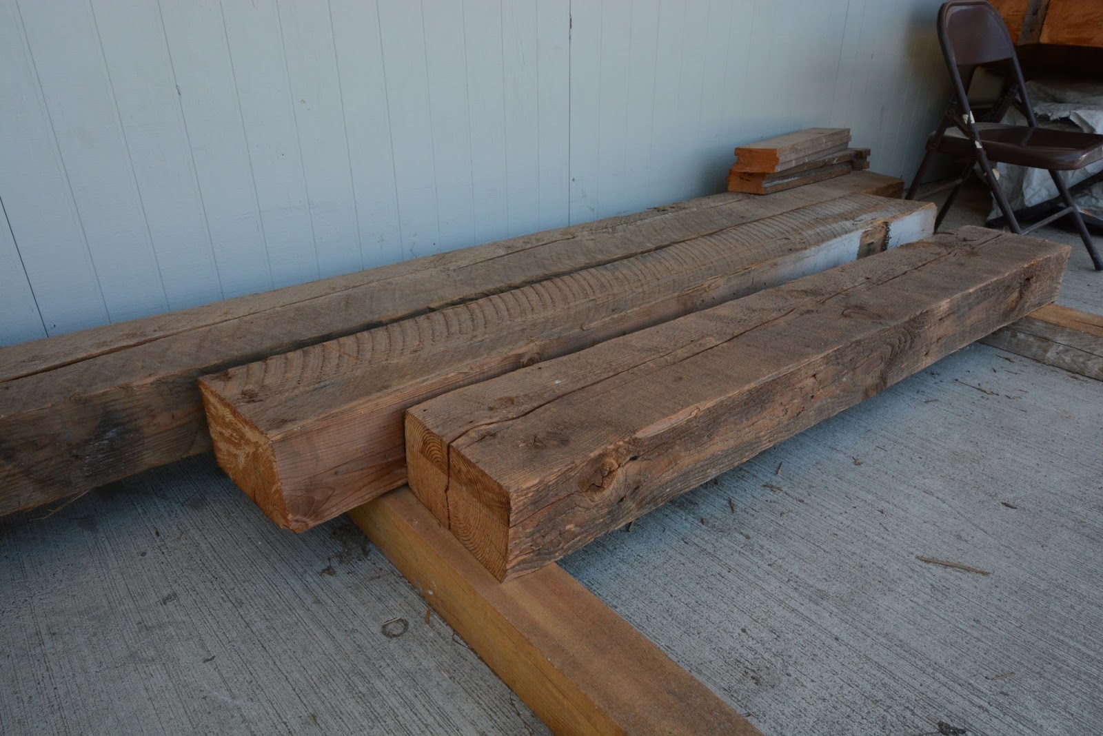
BREAKFAST NOOK during the construction phase.


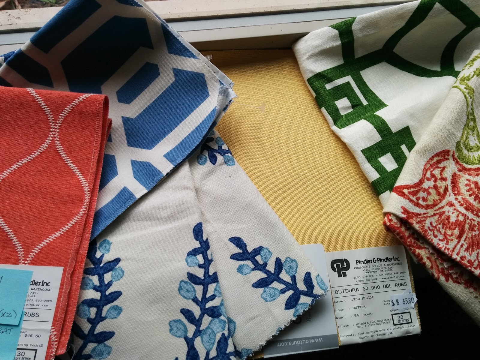
Selecting fabrics for the BREAKFAST NOOK bench and cushions.


And finally, a peek of the BREAKFAST NOOK on the day of the shoot, taken with my cell phone.


Then the  photographer shows up and works his/her magic, finding those special details or angles that show your work in the best possible light.  A good photographer is worth his/her weight in gold--  Someone who takes the time to listen to what you hope to accomplish, which features in the home should be highlighted, and most importantly, someone who "gets" your personal style and the vision for your business.  There is a lot at stake here!  Without a great portfolio, it can be very hard to land new, amazing projects.  I have been using Kristen Buchmann Photography most recently and love the way she finds all the little details in the room.  Those small, artistic "moments" that make you go "oohhhh...so pretty!"  That is so ME--someone who loves all the little details and how they contribute to the bigger picture.  When all the little pieces fit together and a room just feels "right", I get goose bumps and a wide smile on my face.  THAT, is why I do this!

The FOYER during construction


Finished FOYER on the day of the Photo Shoot.


A progress shot of the LIVING ROOM...


...and the finished space!


The DINING ROOM during construction


Selecting chairs and fabrics for the DINING ROOM


The final space, ready for entertaining!

In the end, I decided to use the blue and white pottery collection on the counter of a built-in room divider, as a backdrop to the Living Room sofa, as well as the dining room.  It turned out to be a nice way to keep the blue-and-white theme flowing from room to room.

 
I hope you have enjoyed this sneak peak into one of my now-completed projects, and can appreciate the creative design process a bit more.  As I am hitting "publish", my fabulous photographer, Kristen Buchmann, is prepping my proofs for my viewing.  I am on pins and needles!  Later, after I place my order and she does the final digital editing, I will be sure to share the finished product--those oh-so-important photos that comprise one's professional design portfolio.  I can hardly wait!!!


Sunday, March 6, 2016

Rustic Kitchen Design


I design a lot of white kitchens these days.  And I mean a lot!  Now don't get me wrong, I love white cabinetry (my own kitchen is white), but sometimes it can get a little repetitive.  So I am very excited to announce that I have a new client who specifically requested a non-white kitchen!  She wants warm, rustic with lots of texture....picture knotty alder cabinets, hand-scraped wood floors, a hammered copper farmhouse sink, wood beams on the ceiling, and a heavily textured stone like slate for the backsplash.  Just that little mental picture makes me happy!  I've been scouring Pinterest and Houzz lately for inspiration photos and have come up with some really fun ones.  Want to look with me?  Here are some faves:


This first one is the image I keep coming back to.  I love the two-toned cabinetry and the way the sink base feels like a repurposed piece of furniture.  I also think the blue-gray painted cabinet pairs fabulously with the warm wood tones.  I hope we get to do a similar paint color in this new kitchen project!

Rustic Cottage Kitchen:


This next one...Oh My!  Is there anything NOT to love here?  The ceiling, that big, built-in china hutch with the arched top, the antique rug on the floor, the iron chandeliers over the island.  I want to be here!
http://canadianloghomes.com/blog/wp-content/uploads/2013/12/elegant-rustic-kitchen.jpg:

I also love the look of this open, farmhouse-style island.  The chunky wood legs with exposed joinery are beautiful, and Wow!--that slab of wood on the top is so nice and thick!  I want to hang our here and visit with the cook. 

30 Rustic DIY Kitchen Island Ideas. Love the island, flooring, beams, lamps.:

And of course, what farmhouse kitchen would be complete without a pair of sliding barn doors?  I love that these are a bit different with the seedy, Baroque glass panels.  What a great way to let light in, while obscuring a view that might sometimes be a bit messy.  I know my kitchen isn't always company or camera-ready!

Glass barn doors...Gives charm and a rustic feel to any home, love being able to separate rooms, but open them completely as if doors didn't exist whenever you want!:

One particularly fun feature that my client has requested in an old-fashioned larder.  (Think English farmhouse kitchen, like on Downton Abbey.)  She wants a place to leave her coffee pot plugged in, all her mugs, her teas, her daily essentials...sort of like a mini-pantry right at your fingertips.  I think it's brilliant and see this as being the most used part of the kitchen.

I would love to have this in my house. What a great idea to hide all those small appliances. Favorite Things @Hawthorne and Main:

Also a bit old fashioned, but fun if you eat a lot of vegetables, are some properly vented produce bins.  This storage method seems so much more appealing than the mass of random produce that I currently have in my fridge.  It can be so hard to know what you have going on in there when you have so many items, wrapped in plastic bags, then jam-packed into those tiny bins.  Here you can quickly assess what you have and what needs to be eaten.  Granted, not everything can be stored without refrigeration, but if you had this, would you be more inclined to eat your veggies more regularly?

Bespoke Oak Kitchens - sohofactory Hop Kiln 5  More from "Plain English Design Ltd" Love the simple, light colored dovetailed drawers.  Very nice old fashioned detail.:

I hope you enjoyed this as much as I did and stay tuned for pictures as the project progresses!


Thursday, February 11, 2016

Reclaimed Wood Beams

For the past year or so I have been obsessing over interior spaces that have high or vaulted ceilings and reclaimed wood beams.  I love it when my clients share my passion for that type of character and request that we incorporate it into the new design. Reclaimed wood is everywhere these days, so apparently I am not the only one who can't get enough of it!  Sometimes I wish my present, oh-so-crazy life, could somehow be transported to an old farmhouse in the South of France, where every day I could gaze at thick, plaster walls and lovely, rustic beams.  Alas, I live in the Pacific NW, in a rather plain 70's house with low ceilings and no Old World character to speak of.  Room by room, we're doing our best to add some character and charm back in, but it's a slow process.  We just finished adding some fun, handmade, barn-style doors to our coat closet and game closet and I am thrilled with how they turned out.  Now I am on a mission to find more ways to add more!  Here is a sneak peak:

                     GAME CLOSET DOOR
The little door to the left of the fireplace is what started it all.  During one home improvement session, we ripped some plywood  paneling off of these walls, only to discover that there was a really neat, little closet on the left, which the previous owner had boarded over.  We always need more storage, so we turned it into a game closet.  It just needed shelves and a door.  I liked it so much, that I decided to add a second door to the right, just around the corner, where we have our main coat closet.
 
                                              COAT CLOSET DOOR

This is the new coat closet door which you can see when you come in our front entry.  There was originally a very boring, 6-panel, hollow-core door here.  It definitely wasn't any thing that caught your attention.  Now when people come in, they notice the barn door right away and ask about it.  Character added--mission accomplished!


My little DIY weekend projects pale by comparison to some of the lovely images you can find on the internet.  These interior spaces all incorporate reclaimed wood and in some instances it is hard to tell if you are looking at a new-build or something truly rustic.  Let's see if we can guess which ones are the real-deal and which ones are fabulous fakes, made to look like they are centuries old!

Mediterranean Spaces Reclaimed Wood Farm Table Design, Pictures, Remodel, Decor and Ideas - page 2:
This one almost had me!  At first glance, I thought the furniture indicated a beautifully-aged Mediterranean home, complete with low, humble seating and crumbling, brick hearth.  Then I took a second look and noticed the very precise, symmetrical layout of the room and the clean lines of the plaster walls.  Everything looks just a bit too perfect!  Definitely new build.  Great imitation though! 

Amazing corner. love how beam over window and drapery combo is done. club room:
This next project is by Oz Architects and is definitely new-build, but I love the wood headers along the over-sized windows.  That is a detail I haven't seen before.  I like that they have a cozy little reading/visiting nook adjacent to the kitchen island and the big wall of windows.  I would love to spend some time in that room!

greige: interior design ideas and inspiration for the transitional home : Vineyard Farmhouse in Napa:
This one looks pretty convincing, but I had a hunch it was new because of the height of the ceiling and the large, roomy scale of the space.  Old houses almost always have odd quirks, angles and ceiling heights.  Wouldn't you know it--this lovely home is in Napa!

Floors with reclaimed beams:
This one is tough!  The fireplace looks positively ancient.  So simple, homey and pretty!  Even the floorboards look old and worn.  So I checked the link, only to find that the article was written in a language I don't speak.  I am pretty confident though that this is the real deal, because at the beginning of the article was an image of the exterior, which fairly screamed crumbling French Farmhouse.  So happy to find a nice example of everything I love.  The only thing I don't really dig is the crystal chandelier.  I'm all for eclectic, but this one I just don't "get".


Blue decor is the hottest design trend in 2015, learn from Creative Director Jeff Lewis how to use it in your home. See more inspiration rooms. #LivingSpaces:
And this one I KNOW is a "newer" home where they have added reclaimed beams, but I love how livable this feels.  It's fun, eclectic, and arty, with just the right mix of sophisticated and laid back.  If only I could have those nice, vaulted ceilings in my 70's house.  Ha!

Since we are in the Pacific NW, and there are no crumbling French farmhouses to be found, sometimes one just has to add the character back in.  Here's what that can look like.  First I study the ceiling plan to see where it would make the most sense to add some faux beams.  Then I check the plans and elevations to determine what the height, width and length of the beams should be.  Finally, it is off to the lumber yard to do some shopping!  The one I've been using lately is a good hour from where I live, but going there feels like an extra-special field trip so I don't mind the drive.  It is so fun poking around, looking at all the cool pieces, and imagining where they might have come from or how they could best be incorporated into a new design.  Here is a shot from one of those days:


In the lumber yard, checking out sizes, level of distressing and degree of "checking" or splitting in the ends of the beams.

After I've made my selections, I arrange for the contractor to pick them and haul them back to the construction site.  Then someone gets to work on sprucing them up.  Usually we don't put them up as-is.  That might look great if you were going for the dilapidated barn or warehouse look, but usually the clients want something a bit more refined.  So we lightly sand them and/or add additional distressing (nail holes, burn marks, wire wheeling) until we have just the right look.  Here is what that might look like.  These happen to be remnant ends, cut off the beams and then set aside for finish experimentation.

Here are the beams, back at the house, after the builder had done some sanding to them to achieve a slightly smoother finish and more uniform color.  As you can see, the beam in the middle has some paint on it, which we wanted to remove so as not to detract from the finished look.  Character is good, but distracting color is not.

And finally, here are the beams installed in the space.  The room was still in-progress when this shot was taken, but you can see how much character and warmth they add.  Beautiful!  Stay tuned for final-final shots of this particular project.  My photographer is currently wrapping up the photo edits and I am super excited to add them to my portfolio in the near future.