Tuesday, April 5, 2016

The Real Truth: Photo Shoots

This last weekend I had a photo shoot at a client's house and I am exhausted!  I bet many of you see gorgeous photos in magazines and think those homes look that way all the time.  Don't be fooled.  Even the loveliest homes are staged a bit for photographs.  There are actually design trade professionals known as "photo stylists" who specialize in prepping homes for their close ups.  Some are even employed by magazines.  What a fun job that would be!

Most of my projects are architectural in nature (designing custom homes, kitchens, baths, etc.) and often the client doesn't request help with furniture or décor, until the very end, almost as an afterthought.  I gladly assist with these requests, but even then, they frequently fall short of what I would consider 100% complete.  Because of that, when it's time to photograph a project for my portfolio, there are often gaps to be filled.  Sometimes these gaps are large (missing furniture) and sometimes they are small (needing accessories).  Either way, if I'm going to invest the time and money in photographs, I have to address these missing pieces. 

Such was the case this last weekend.  First, let me just say, this was an amazing project.  I asolutely LOVED working on the interior of this custom home with the help of Krannitz Gehl Architects. http://krannitzgehl.com/   (Construction by Anderson Construction Group) It was a dream project to be sure:  waterfront location, classic Nantucket Shingle-Style architecture, and a young, female client with strong sense of personal style and a fearless approach to color.  Imagine bright, pure, saturated colors, like yellow, green, blue and coral, all mixed with loads of white--perfect for a house on the water!  When she hired me, I was  asked to help with selecting interior finishes and draw up tile details, but the job quickly grew into so much more.  I was in designer heaven! 


Most of my work looks like this: construction site visits and working out the architectural features and finishes.  Here is the KITCHEN, under construction.


And this...lots of tile work. (MASTER SHOWER)  I love selecting the pieces and designing the layout.


Then, if I am lucky, the client asks me to help with furniture and upholstery.  On this project, the client wanted lots of color and playful prints.  The challenge was making the house flow and not feel like a circus.  I think we accomplished that.  My photographer commented that this was one of the happiest-feeling homes she had ever been in!

So here we are two years later...and two babies later for my client!  (How she had the energy to do all this I will never know.)  The house is nearly perfect, and we certainly accomplished a lot in those two years.  The rooms are stunning, with gorgeous finishes and LOADS of classic, architectural features.  We also had the time to do a few custom upholstery projects, add beautiful custom window treatments, select fun light fixtures, and sprinkle the house with bright and colorful textiles.  Now though, the client has a toddler AND a newborn at home and understandably wants a break from designing and decorating!  So I figured no time like the present to get this project wrapped up an photographed  Here's an inside peek at what this process looks like for me:

First, I start by going through a series of "progress shots" that I keep on file, making notes of what major pieces are missing, what might look awkward in a professional photograph, or what could possibly be the perfect finishing touch.  I like to print out photos on my office printer and scribble notes and ideas right on the printed photo.  For some reason, I am better able to analyze a space and "fix" the problem this way.  Sometime I even use this approach when designing for a client.


This was the house towards the end of our work.  The chair was left over from a previous home and didn't seem to fit, so we swapped it with a chair from another room, and had that chair and the sofa reupholstered. 


And another progress shot.  This was taken after the window treatments were up, with matching custom pillows.  The client had added a very nice jute area rug--perfect for a casual beach house.  However, the sofa still needed some work.  The striped throw was covering some less-than-pretty wear and tear on the seat.


A peek at how I work--a photo of the room, with loosely sketched furniture and décor ideas, as well as notes so that I can remember what I am thinking.  The fun part is in seeing the finished room next to these quick little sketches!


More ideas: The kitchen shot from Pinterest (on the left) actually had the very same fabric on the window treatment that we used, and our cabinetry and sink looked very similar too.  How handy to be able to see how someone else finished off their room with some simple greenery by the sink and a pretty, blue hand towel, casually tossed over the rim.  (I actually "borrowed" this towel idea for my photo shoot.) The image on the right caught my eye because we had an almost identical design for our breakfast nook--a bench seat in the background and some lacquered, faux-bamboo chairs in the foreground.  I liked the table décor and the height/angle from which this photo was taken. 

 
Truth be told, I spend hours on Pinterest, looking at images, trying to get ideas on how to best feature a room, or how to expertly arrange the perfect vignette of accessories.  I have loads of these images pinned!  Check out a few of my idea files here:   https://www.pinterest.com/sheilamayden/accessories/


Living room: Blue curtains, white couch and walls, multitude of blue and white patterned vases, wooden table and blue cushions:

Here is one such Pinterest photo:  I knew I wanted to add some blue and white pottery to at least one or two of the rooms, so this image caught my eye.  The blue and white pottery has such a beautiful, classic look for a beach house.  I also liked the coffee table décor.


white cabinets black countertops hardwood floors:

More blue and white pottery found on Pinterest.  I didn't add the pottery to the kitchen like they did here, but I liked looking at the assortment of sizes and shapes and how the pieces were arranged.


Full disclosure here: Decorating was not something they taught me in my Interior Design program at Bellevue College, so it is something I have had to study and learn on my own.  I love it, but it feels a little less natural to me than designing the architectural features of a home and it is an art form I am always trying to hone and perfect. 

Next, I spend hours shopping, both online and in stores, looking for the perfect pieces to use for my staging.  Of course budget is critical here.  I want it to look like a millions bucks, but I don't want to spend a million bucks!  And because I've done so many of these now, I have countless Rubbermaid tubs, filled with home products just for this purpose.  It's kind of fun to dig these out of storage and go through them, "shopping" for things that I already own!  Sometimes, I might even borrow items from my own home, such as house plants, lamps, an accent pillow or two.  Whatever works I say! 
I start this whole "prep" process weeks in advance--planning, shopping, taking notes, and thinking about how I want the entire house to feel and look.  Soon shopping bags and delivery boxes start to pile up and eventually, it feels like they are completely swallowing my office.  (This part drives me more than a little nuts.  I could definitely use more space during this phase.)


Here is a shot I took while playing around with décor in my then cluttered office, trying to decide what I wanted to use for the coffee table centerpiece.


And the finished product.  (LIVING ROOM)  I love how it all turned out.  The blue white and green looked so fresh and pretty!


 Then just when I think I can't take it any more, the photo shoot day finally arrives.  I buy loads of fresh flowers, some tasty-looking produce or food items for the kitchen, then all those blue bins and pieces of furniture get loaded into my not-so-glamorous (but highly-functional!) mini-van. I head on out to the client's home, feeling a bit sheepish as it clearly looks as if I am moving in.  Some clients are a bit shocked, but I think most are fascinated by the process, and besides, who doesn't want to see their home magically transformed into something magazine-worthy, all in the course of a few hours? 

If I am lucky, I have an assistant or two to help me with the pre-photo session cleaning, de-cluttering, and final staging.  It is serious work and you have to have stamina for this, not to mention muscles!  Those big blue tubs weigh a ton!  Lucky for me, I have had a great assistant on my last few photo shoots--someone who intuitively knows what to do, with little instruction.  (Thank you Brandi Cook!) It is so exciting to see the spaces come together and look like you always pictured them.  The process is so rewarding and you always hope the homeowner will be just as thrilled and inspired. 

BREAKFAST NOOK during the construction phase.


Selecting fabrics for the BREAKFAST NOOK bench and cushions.


And finally, a peek of the BREAKFAST NOOK on the day of the shoot, taken with my cell phone.


Then the  photographer shows up and works his/her magic, finding those special details or angles that show your work in the best possible light.  A good photographer is worth his/her weight in gold--  Someone who takes the time to listen to what you hope to accomplish, which features in the home should be highlighted, and most importantly, someone who "gets" your personal style and the vision for your business.  There is a lot at stake here!  Without a great portfolio, it can be very hard to land new, amazing projects.  I have been using Kristen Buchmann Photography most recently and love the way she finds all the little details in the room.  Those small, artistic "moments" that make you go "oohhhh...so pretty!"  That is so ME--someone who loves all the little details and how they contribute to the bigger picture.  When all the little pieces fit together and a room just feels "right", I get goose bumps and a wide smile on my face.  THAT, is why I do this!

The FOYER during construction


Finished FOYER on the day of the Photo Shoot.


A progress shot of the LIVING ROOM...


...and the finished space!


The DINING ROOM during construction


Selecting chairs and fabrics for the DINING ROOM


The final space, ready for entertaining!

In the end, I decided to use the blue and white pottery collection on the counter of a built-in room divider, as a backdrop to the Living Room sofa, as well as the dining room.  It turned out to be a nice way to keep the blue-and-white theme flowing from room to room.

 
I hope you have enjoyed this sneak peak into one of my now-completed projects, and can appreciate the creative design process a bit more.  As I am hitting "publish", my fabulous photographer, Kristen Buchmann, is prepping my proofs for my viewing.  I am on pins and needles!  Later, after I place my order and she does the final digital editing, I will be sure to share the finished product--those oh-so-important photos that comprise one's professional design portfolio.  I can hardly wait!!!


Sunday, March 6, 2016

Rustic Kitchen Design


I design a lot of white kitchens these days.  And I mean a lot!  Now don't get me wrong, I love white cabinetry (my own kitchen is white), but sometimes it can get a little repetitive.  So I am very excited to announce that I have a new client who specifically requested a non-white kitchen!  She wants warm, rustic with lots of texture....picture knotty alder cabinets, hand-scraped wood floors, a hammered copper farmhouse sink, wood beams on the ceiling, and a heavily textured stone like slate for the backsplash.  Just that little mental picture makes me happy!  I've been scouring Pinterest and Houzz lately for inspiration photos and have come up with some really fun ones.  Want to look with me?  Here are some faves:


This first one is the image I keep coming back to.  I love the two-toned cabinetry and the way the sink base feels like a repurposed piece of furniture.  I also think the blue-gray painted cabinet pairs fabulously with the warm wood tones.  I hope we get to do a similar paint color in this new kitchen project!

Rustic Cottage Kitchen:


This next one...Oh My!  Is there anything NOT to love here?  The ceiling, that big, built-in china hutch with the arched top, the antique rug on the floor, the iron chandeliers over the island.  I want to be here!
http://canadianloghomes.com/blog/wp-content/uploads/2013/12/elegant-rustic-kitchen.jpg:

I also love the look of this open, farmhouse-style island.  The chunky wood legs with exposed joinery are beautiful, and Wow!--that slab of wood on the top is so nice and thick!  I want to hang our here and visit with the cook. 

30 Rustic DIY Kitchen Island Ideas. Love the island, flooring, beams, lamps.:

And of course, what farmhouse kitchen would be complete without a pair of sliding barn doors?  I love that these are a bit different with the seedy, Baroque glass panels.  What a great way to let light in, while obscuring a view that might sometimes be a bit messy.  I know my kitchen isn't always company or camera-ready!

Glass barn doors...Gives charm and a rustic feel to any home, love being able to separate rooms, but open them completely as if doors didn't exist whenever you want!:

One particularly fun feature that my client has requested in an old-fashioned larder.  (Think English farmhouse kitchen, like on Downton Abbey.)  She wants a place to leave her coffee pot plugged in, all her mugs, her teas, her daily essentials...sort of like a mini-pantry right at your fingertips.  I think it's brilliant and see this as being the most used part of the kitchen.

I would love to have this in my house. What a great idea to hide all those small appliances. Favorite Things @Hawthorne and Main:

Also a bit old fashioned, but fun if you eat a lot of vegetables, are some properly vented produce bins.  This storage method seems so much more appealing than the mass of random produce that I currently have in my fridge.  It can be so hard to know what you have going on in there when you have so many items, wrapped in plastic bags, then jam-packed into those tiny bins.  Here you can quickly assess what you have and what needs to be eaten.  Granted, not everything can be stored without refrigeration, but if you had this, would you be more inclined to eat your veggies more regularly?

Bespoke Oak Kitchens - sohofactory Hop Kiln 5  More from "Plain English Design Ltd" Love the simple, light colored dovetailed drawers.  Very nice old fashioned detail.:

I hope you enjoyed this as much as I did and stay tuned for pictures as the project progresses!


Thursday, February 11, 2016

Reclaimed Wood Beams

For the past year or so I have been obsessing over interior spaces that have high or vaulted ceilings and reclaimed wood beams.  I love it when my clients share my passion for that type of character and request that we incorporate it into the new design. Reclaimed wood is everywhere these days, so apparently I am not the only one who can't get enough of it!  Sometimes I wish my present, oh-so-crazy life, could somehow be transported to an old farmhouse in the South of France, where every day I could gaze at thick, plaster walls and lovely, rustic beams.  Alas, I live in the Pacific NW, in a rather plain 70's house with low ceilings and no Old World character to speak of.  Room by room, we're doing our best to add some character and charm back in, but it's a slow process.  We just finished adding some fun, handmade, barn-style doors to our coat closet and game closet and I am thrilled with how they turned out.  Now I am on a mission to find more ways to add more!  Here is a sneak peak:

                     GAME CLOSET DOOR
The little door to the left of the fireplace is what started it all.  During one home improvement session, we ripped some plywood  paneling off of these walls, only to discover that there was a really neat, little closet on the left, which the previous owner had boarded over.  We always need more storage, so we turned it into a game closet.  It just needed shelves and a door.  I liked it so much, that I decided to add a second door to the right, just around the corner, where we have our main coat closet.
 
                                              COAT CLOSET DOOR

This is the new coat closet door which you can see when you come in our front entry.  There was originally a very boring, 6-panel, hollow-core door here.  It definitely wasn't any thing that caught your attention.  Now when people come in, they notice the barn door right away and ask about it.  Character added--mission accomplished!


My little DIY weekend projects pale by comparison to some of the lovely images you can find on the internet.  These interior spaces all incorporate reclaimed wood and in some instances it is hard to tell if you are looking at a new-build or something truly rustic.  Let's see if we can guess which ones are the real-deal and which ones are fabulous fakes, made to look like they are centuries old!

Mediterranean Spaces Reclaimed Wood Farm Table Design, Pictures, Remodel, Decor and Ideas - page 2:
This one almost had me!  At first glance, I thought the furniture indicated a beautifully-aged Mediterranean home, complete with low, humble seating and crumbling, brick hearth.  Then I took a second look and noticed the very precise, symmetrical layout of the room and the clean lines of the plaster walls.  Everything looks just a bit too perfect!  Definitely new build.  Great imitation though! 

Amazing corner. love how beam over window and drapery combo is done. club room:
This next project is by Oz Architects and is definitely new-build, but I love the wood headers along the over-sized windows.  That is a detail I haven't seen before.  I like that they have a cozy little reading/visiting nook adjacent to the kitchen island and the big wall of windows.  I would love to spend some time in that room!

greige: interior design ideas and inspiration for the transitional home : Vineyard Farmhouse in Napa:
This one looks pretty convincing, but I had a hunch it was new because of the height of the ceiling and the large, roomy scale of the space.  Old houses almost always have odd quirks, angles and ceiling heights.  Wouldn't you know it--this lovely home is in Napa!

Floors with reclaimed beams:
This one is tough!  The fireplace looks positively ancient.  So simple, homey and pretty!  Even the floorboards look old and worn.  So I checked the link, only to find that the article was written in a language I don't speak.  I am pretty confident though that this is the real deal, because at the beginning of the article was an image of the exterior, which fairly screamed crumbling French Farmhouse.  So happy to find a nice example of everything I love.  The only thing I don't really dig is the crystal chandelier.  I'm all for eclectic, but this one I just don't "get".


Blue decor is the hottest design trend in 2015, learn from Creative Director Jeff Lewis how to use it in your home. See more inspiration rooms. #LivingSpaces:
And this one I KNOW is a "newer" home where they have added reclaimed beams, but I love how livable this feels.  It's fun, eclectic, and arty, with just the right mix of sophisticated and laid back.  If only I could have those nice, vaulted ceilings in my 70's house.  Ha!

Since we are in the Pacific NW, and there are no crumbling French farmhouses to be found, sometimes one just has to add the character back in.  Here's what that can look like.  First I study the ceiling plan to see where it would make the most sense to add some faux beams.  Then I check the plans and elevations to determine what the height, width and length of the beams should be.  Finally, it is off to the lumber yard to do some shopping!  The one I've been using lately is a good hour from where I live, but going there feels like an extra-special field trip so I don't mind the drive.  It is so fun poking around, looking at all the cool pieces, and imagining where they might have come from or how they could best be incorporated into a new design.  Here is a shot from one of those days:


In the lumber yard, checking out sizes, level of distressing and degree of "checking" or splitting in the ends of the beams.

After I've made my selections, I arrange for the contractor to pick them and haul them back to the construction site.  Then someone gets to work on sprucing them up.  Usually we don't put them up as-is.  That might look great if you were going for the dilapidated barn or warehouse look, but usually the clients want something a bit more refined.  So we lightly sand them and/or add additional distressing (nail holes, burn marks, wire wheeling) until we have just the right look.  Here is what that might look like.  These happen to be remnant ends, cut off the beams and then set aside for finish experimentation.

Here are the beams, back at the house, after the builder had done some sanding to them to achieve a slightly smoother finish and more uniform color.  As you can see, the beam in the middle has some paint on it, which we wanted to remove so as not to detract from the finished look.  Character is good, but distracting color is not.

And finally, here are the beams installed in the space.  The room was still in-progress when this shot was taken, but you can see how much character and warmth they add.  Beautiful!  Stay tuned for final-final shots of this particular project.  My photographer is currently wrapping up the photo edits and I am super excited to add them to my portfolio in the near future.


Sunday, February 8, 2015

New-Found Love for Navy


It's been ages since I posted on my blog and I'm feeling rather embarrassed about it.  The truth is, I've been in what feels like "survival mode" since the birth of our third son last May.  He's an easy baby to be sure, but when you add new baby to a full client load, two older siblings, a house that needs constant cleaning, massive amounts of laundry, teaching an evening class once a week, what feels like a full social calendar, and a husband who understandably wants some time with his wife....well, something has to give.  For me it's been the blog.  Now, eight months in, I'm trying desperately to sweep out the cobwebs, whip my life back into shape, and get back to the old me.  That's hard to do with a baby who up 'til now hasn't been a very good sleeper at night, but we're working on that too!  I am determined to get back to a healthy balance of kids, family, clients and the things that I love.


Here is Anders, my little kitchen helper.  At 8+ months he is crawling and into everything!
One of the things I love about my my job (among many!) is the interesting people that I get to work with.  Every project brings new personalities, new tastes, new lifestyles and new challenges--it's never dull!  With every client, I get to explore and enjoy some new idea or aspect of design, all the while living a bit vicariously through their home renovations or new-builds.  Often times, those same clients influence what I am most obsessed with at that point in time, be it a style of furniture, a color palette, a type of light fixture, or a particular material.  I love to dive in and sort of become "my clients" for the duration of the project, immersing myself in their world.

I have a current client who recently told me, when I showed her a wallcovering sample, "Oh good, I LOVE anything Navy!"  I got to thinking about it later...I've had lots of clients that request the color blue, but I don't think I've ever had someone come to me and say, I love Navy Blue and I want to use it in my home.  And come to think of it, Navy isn't a go-to choice for me when I'm pulling together color schemes for my clients.  Maybe I've always shied away because I've been afraid of the overly predictable Blue and White "Nautical Look."  It's classic to be sure, but it's been done so many times; I get nervous about anything that can start to feel cliché.  The funnier thing to me is that one of my favorite decorative elements in my own home happens to be predominatly Navy: a pair of off-the-shelf drapery panels from Crate in Barrel that I bought several years ago when we moved into our house.   They have a deep Navy background color, layered over with huge, green, yellow and white tropical-looking flowers.  They hang in my kitchen in our breakfast nook area and when I look at them I always feel happy.  So why am I not using more of this color?

My kitchen drapery panels that I love so much.  
It's certainly not that I don't like the color Navy.  A quick perusal of my Pinterest and Houzz folders quickly showed me that I've been attracted to it all along.  It's there, but I've never paid attention to how often it appears in the inspiration photos that I collect.  And looking at these images for the second and third time has confirmed that I've been seriously overlooking the great potential that Navy offers!  So here we go--thanks to the help of my fun and amazing client Amanda, a new-found love for Navy and a handful of inspiring photos that have me determined to use it more often.

One of the first emerging patterns that I noted in my photo collections was built-in cabinetry painted in the color.  Navy makes ordinary cabinets look A-mazing!  Here are some of my favorites:

Navy Mahogany Built-In Bar With Coral Decor
High-gloss Navy cabinets in Sue De Chiara's Connecticut home, designed in collaboration with Lauren Muse
of Muse Interiors.


navy cabinets, pearlescent tile, wire screens on upper cabinets
Source: Décor Pad.  "Small, chic butler's pantry features navy upper cabinets accented with chicken wire doors over navy lower cabinets paired with white marble counter and white iridescent grid tiled backsplash."


The space appeals to the wine enthusiast, featuring two Thermador wine columns and custom cabinetry designed for ample storage of stemware.
A gorgeous party-prep kitchen in the DC Design House, by Aiden Design.
Notice how they've paired the Navy cabinets with white in each of the rooms, whether it be the tile backsplash, a tile floor, or simply white accessories.  There's just no getting around it--white makes Navy pop!  Does that automatically make these rooms feel nautical?  I don't think so.  However, it does give them a classic, rooted-in-history feel, while at the same time being modern and fresh. What I love about the first example is the high-gloss finish on the cabinets.  Now that is gutsy!  And the way the deep, shiny finish makes those handsome, nickel bin pulls just jump off the page.  By comparison, the second example seems a bit more subdued, with what appears to be a Satin finish on the cabinets.  It's equally handsome though, with the rich, dark wood flooring, the classic white wall paneling, and the iridescent mosaic grid backsplash.  And the third example...oh my, I think I am drooling!  That Calcutta Marble herringbone floor, the rustic wood prep-table, the sleek, brushed brass hardware, the way the cabinetry panels extend to the ceiling and frame out the pass-through into the adjoining room.  Everything here is perfection.

For similar reasons, I love the use of Navy on wainscoting or wall paneling.  It feels rich, luxurious, and oh-so handsome.  I notice that even Pottery Barn has shot of lot of their most recent catalog images against just such a backdrop.  Maybe Navy is the "It" color of the moment!Sherwin Williams Articles  I am convinced that Navy paneled walls add instant masculine appeal and grab you in a way that traditional white paneling just can't.  When I see paneling done like this--and I love just about any kind of paneling--my heart skips a beat and I can't help but stop and stare!  Something about it mesmerizes me and I can't take my eyes off of it.  It makes the other elements in the room look even better, provided there are enough white or light tones in the room to balance the depth and darkness of the blue.

obsessed w. this paint color - farrow & ball hague blue.
Image found on sarahbarksdale.com.  Paint color is Farrow and Ball Hague Blue.
This bathroom takes my breath away. Stunning and elegant. The rich, dark color on the wall is regal in every way.
Here bathroom designer Robert Moore has painted the walls in a deep blue, 'Basalt' by Little Greene
 And in my book, a close runner-up to Navy-hued wall paneling, is Navy grasscloth wallpaper, especially when paired with a crisp, white wainscoting.  It's unexpected, bold, and feels very "current" yet refreshingly non-trendy.  I would do this in a heartbeat in an old, traditional-style home.  Or, a new home that you want to give instant, historic-feel.

again, dark wood against the dark blue, but balanced by white... that's why it doesn't seem overwhelmed by the dark... note the lighter mirror over the dark dresser
Found on BHG blog.

Peacock blue grasscloth & lacquer cabinet
Lovely little bath, found on Pinterest.  Notice how amazing Navy grasscloth  looks against gold fixtures.

But if all this wall paneling, fancy cabinetry and grasscloth wallcoverings just aren't in the budget, and they aren't for a lot of us, a Navy coat of paint on a wall or two can go a long way.  These rooms have serious design-cred, even with a simpler, less costly application of the color.
Modern living room, Medici Sectional Sofa with Track Arm | Hudson's Bay
Image from Cote Maison, via Pinterest.
nursery idea. Make it a room you can hang out in as well. Decorate it for the baby later when he/she is older
Nursery by LeSueur Interiors.  (I am a big fan of Meg Lonergan's work!)
Do Navy walls still seem like too big of a commitment?  Okay, then working our way down the list... How about a piece of Navy furniture?  I love older pieces, re-painted and repurposed.  After seeing these images, I think Navy is going to be my go-to color for painted furnishings.  I am going to be scouring Craigslist for some tasty furniture finds then making my way to my local paint store!  Okay, maybe not today, but in a few months when the baby is sleeping through the night and I feel ready to tackle a project in my "spare time."
ENTRY  navy dresser- antique store (paint is polo blue Benjamin Moore, pulls from House of Antique Hardware)  gold mirror- craigslist  W mirror- Pottery Barn Kids  black lamps- Target  white shades- Target  greek key trim- Walmart  gold Asian bust- antique store  zebra wood frame- Pottery Barn  blue bowl- World Market  silver plated bowl- One Kings Lane  navy rug- One Kings Lane (Thom Filicia)  drum shade- Andrews Lighting in OKC  bird box- Anthropologie  Callies home tour on LGN
Simple, Navy chest of Drawers.  Image from LittleGreenNotebook.BlogSpot.com. 


I love the salmon-ey pink inside...thinking I should paint the inside of my built in hutch this color.
Hello Gorgeous!  Love the Coral interior!  Found on rrantiques.tumblr.com.


This last point brings me to another great question: "What colors are best paired with Navy?"  Ha ha, that's actually a trick question.  I think you can put just about anything with Navy, similar to the way denim blue jeans seem to look good with everything in your closet.  Pondering this brings to mind the sage advice of style maven, Stacy London, on the show "What Not to Wear" (yes, I was addicted to that show ages ago, before the kids arrived), who said something to the effect that Navy is one of your neutrals, just like gray or black, and you can wear it with anything.  The same goes with interiors.  A bit of Navy works just about anywhere you want to put it.  However, here are some of my favorite pairings:


London home of interior designer Bunny Turner of  Turner Pocock. The walls are painted in 'Squid Ink' from Paint & Paper Library.
Lovely and serene, a Green, White and Navy spare bedroom, belonging to Bunny Turner.


Caitlin Wilson | Navy Fleur Chinoise, Pink City Maze, and Gold Dot styled by Jana Bek Design
Navy, White and Bubble-gum Pink!  How pretty and fun! (Pillow textiles by another favorite blogger, Caitlin Wilson.)


HGTV Dream Home 2015 on Martha's Vineyard - Cuckoo4Design
Navy, Pale Blue, White, and Orange.  Notice how there is color hierarchy?  The strong orange accent only appears in small doses and is surrounded by a calming sea of White.  Love it!  (From the HGTV Martha's Vineyard Dreamhome)


Orange and navy decor in a living space... the complimentary colors work well in this room without bogging it down from too much color or the brightness. Good ideas! /ES
Is anyone else out there scared to try Red, White and Blue...afraid of being cheesy?  Here one can see that it is all about choosing the right shade of those colors.  This orange-ish hue of red, one that I would call "Tomato-Soup Red,"  looks very sophisticated here, when paired with White and Navy Accents.  I also love the fun blend of textiles and patterns--all by Thibaut, but of course!

I could go on an on, but by now most of my readers are probably snoring, so I'll just wrap things up by saying that besides favorite color pairings, I've also decided that I have a favorite material/texture pairing when it comes to using Navy.  Can you guess what it is?  Here are some visual hints:


Rustic kitchen island
Image from Williams Sonoma.


Wooden window frames and furniture add a rustic touch to this room.
I can't quite tell if this wall color is a deep Navy or Black, but regardless, I love how it makes the soft, honey tone of the wood window casing and chest pop!  So much character!  Found on Pinterest and Brit.co. 


I dig everything about this and still roll my eyes that my bedroom was this color for years and folks went "AGH" and now its all *that*, gheesh...but its a rockin moody color!
Maybe more of an Indigo, but still lovely!  Found on Pinterest and DesignSponge.

Navy distressed but on nightstand!

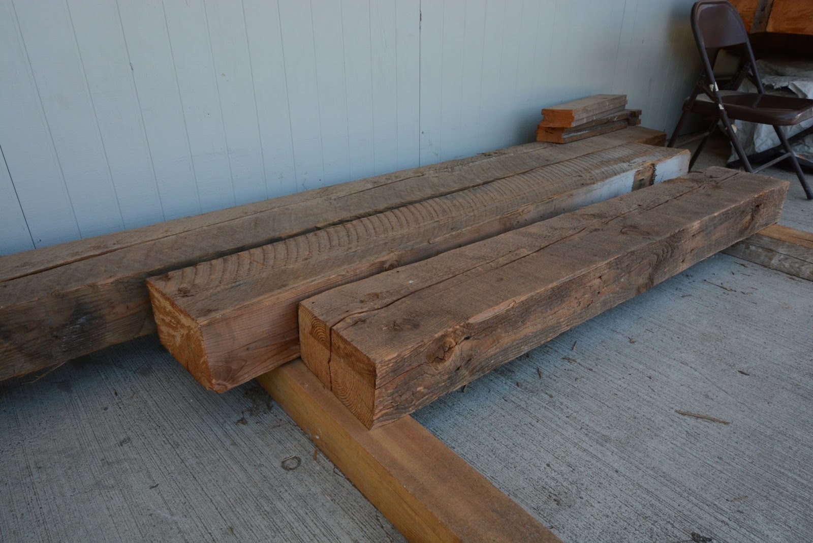
The answer is natural or distressed/reclaimed wood.  I love distressed wood in general, but somehow I think it looks even more incredible against a rich, dark Navy.  The two seem made for each other.  Come to think of it, they would be wonderful in a little boy's room!  Which gets me back to my first point.  I have a few boys to chase around the house tonight, so signing off, and hopefully not for 6 months like last time.

Yours truly,

Sheila boy-am-I-tired Mayden.  

PS In an effort to be honest and transparent, let me just say that it only took me about 3 weeks and 10-12 logins to actually get this post up and running!  Clearly, I am a long way from being back to the "old me."


Sunday, July 6, 2014

New Baby, No Time to Spare

It's amazing how much a new baby changes your life!  Sweet baby Anders made his debut a little over seven weeks ago, and since then my life has felt like a blur.  I've barely had a change to log onto Facebook, much less add posts to my design blog.  Even with a ton of help from both sets of grandparents, we are struggling to keep things running in the Mayden house.  What little energy I have to spare is going into work-related projects and running the business.  (Construction doesn't stop when you have a baby!)  So, sadly, the blogging has had to get put aside for a while, at least until we find our rhythm again.  For now, I'm posting some favorite family photos, showing what my life has been like these last couple months.

Mother's Day, pre-baby.  Jasper and Karsten were so excited to give me their cards that they didn't even take the time to get dressed first.

Anders Johann Mayden.  Born May 15th, 2014, weighing 8lbs 2oz and sporting a lovely head of dark hair.

Anders first bath at home.


One thing's for sure: this baby gets lots of attention from his brothers! Here Karsten checks in at feeding time.

Sweet little baby feet!  I take a picture like this with each of my boys, so I can remember their adorable their little toes.

Here is Anders today, hanging out with Daddy and Jasper.  What sweet boys I have! 


Anders is starting to smile now. This is the part I love!  Here Daddy makes him grin.

So there you have it--the last two months for me.  These happy moments seen here, plus more than a few sleepless nights, tons of kid-generated chaos, and all the stress of work.  Ahh, it's a wonderful life and I wouldn't trade it for anything.  I feel so blessed right now.


Friday, May 9, 2014

The Evolution of a Dining Room

My last blog post featured an updated fireplace in a client's home and gave a sneak peak at some of the work we've been doing in her living room.  In addition to the fireplace, there are several other things we've been working on, including custom living room furnishings and a handful of adjustments to the existing dining room layout and decor.  While I want to save the full reveal for a time when we've been able to get in there and properly photograph the entire space, I thought it would be fun to share how we've transformed her dining area from somewhat plain and lacking in focus, to a room that is stylish and cohesive, all with just a few adjustments that can be easily replicated.  (To be fair, while I make this sound simple, the transformation took place in stages over the course of several months.)  Here's how we did it.

When we started, the client had a fairly new dining set in perfect condition.  The set wasn't necessarily in keeping with the new style direction she wanted to go in, (Translation: more contemporary, with a touch of mid-century and "glam" mixed in) but she very matter-of-factly stated that she didn't want to replace it.  While I don't consider myself a wasteful person, this type of situation is always a big challenge for designers--how to work in preexisting pieces without compromising the integrity of the new design. We smile at the client and say "no problem," but inwardly we're groaning!  Several things bugged me about this particular set.  For starters, the chair seats were covered in black leather.  Practical to be sure, but also aesthetically boring.  Secondly, the scale didn't seem right for the space.  It looked too small and all those identical chairs created visual clutter instead of supporting the room's most obvious focal point: the formal dining table.  Beyond the dining table were two additional major pieces that, while beautiful, weren't living up to their full potential.  One was a gleaming baby grand piano, tucked in a corner so far away from the viewer that it was hard to appreciate its gorgeous lines and stately elegance.  The other was a beautiful yet misplaced antique chaise lounge, which seemed to reside in an awkward location.    
The "Before" shot of the Dining Room


Clearly, the first order of business was a new furniture layout for the room.  We decided to anchor the space with a very large, custom area rug in a single, rich shade of teal.  We choose that color because it complimented the tones in the hardwood floors and because teal was also the primary accent color in the adjacent living room.  Repeating the same accent color helped us to unify these two areas.  Then we turned the existing table at an angle, which is always more visually dynamic, and allowed for better flow between the indoor dining space to the adjoining outdoor patio.  The chaise went away (sadly, it just wasn't right for this project) and instead we brought in a new console cabinet, which is intended to function as a bar area.  The new console has the mid-century feel that the client wanted, and is distinctively different in style and finish from the dining room table, to keep things from feeling too "matchy-matchy"--one of my biggest pet peeves.  We relocated the console to the corner previously occupied by the piano and moved the piano to a more prominent position, just off the foyer and next to a beautiful, art-glass wall that had been added during an earlier remodel.  In this new arrangement, the piano and the glass wall are like a dynamic duo, each calling attention to one another without competing or clashing.    

To freshen the dining set, we had the chair seats reupholstered in a fun fabric that features a popular mid-century Sputnik motif.  The fabric pattern is small in scale, so it's subtle. But it helps the chairs to relate to the character of the buffet, as well as the new pieces that were purchased for the Living Room.  (Design Tip: changing the fabric on dining chairs is always a good way to update the look of a room when operating on a limited budget.  Minimal yardage is needed and while we had ours professionally done, swapping out the fabric is an easy DIY project that can be done in a couple hours with the aid of a staple gun.  I can't tell you how many times I changed out the fabric on the thrift-store dining chairs I owned during my college and pre-married days.

At this point, things were starting to look better, but we still needed a few major tweaks to whip this room into shape.  Here's how it looked mid-project: improved, but not yet great.


A quick photo analysis told me that a handful of things still needed attention: 1) The new rug, while beautiful, needed to be balanced with the addition of some equally bold pieces.  (When I look at this photo, all I see are bold rug and black piano.  Everything else just seems to be a jumble.)  2)  Then there was the new console cabinet.  Charming to be sure, but lost and lonely looking in the corner.  What we needed was some height behind it, to balance the room and draw the eye from foreground to background.  3) Lastly, the dining set still needed some major "ooomph."  Even with the new upholstery, it continued to look like a collection of uninteresting chairs.  So I did what I always like to do when I'm feeling a little puzzled, mid-project.  I took this photo, laid some tracing paper of the top, and began to sketch ways to "fix" the room.  (I should interject here that in my line work, some rooms come together seamlessly from initial concept to completion, with no adjustments needed along the way.  Others, like this one, are a series of alternating additions and re-evaluations until the project is finally complete.)

 I then sourced the items shown in the sketch and presented everything to the client.  Thankfully, she was on board and got right to work ordering the pieces I suggested: two captain's chairs in ivory leather to anchor the ends of the dining table, a pair of over-sized mirrors to go behind the bar console, and a chic lamp to top it off.  Also at my recommendation, she replaced the large single painting behind the piano with a trio of three smaller pieces and and viola, the room  looks SO much better!  

The dining set, with the new leather end-chairs, now fits the scale of the space much more appropriately.  The ivory leather looks fresh and pretty against the teal rug and adds major pop against the backdrop of the glossy black piano.  The large mirrors behind the bar console add height and drama, while intentionally repeating the black finish of the piano.  The new art trio is more visually stimulating that a single painting and  keeps the back wall from looking too heavy.  In my mind, this portion of the project was a success and I'm glad the homeowner trusted me through the various stages of the design process.  She now she has a very interesting and dynamic dining space that  I hope she'll feel proud to entertain in.  She got to keep her dining set, and I'm no longer groaning on the inside.  "No problem" really was "no problem."  The client is pleased and therefore so am I.